Eye-catching Plastic: The Best Card Designs from Digital Banks
The number of online/digital only banks promoting a unique brand marketed as a standalone solution continues to mushroom. Combined with some of the best card designs in the market makes them appealing options.
I am not talking here about the growing number of digital sub-brands of established, incumbent banks such as DBS’ successful digibank, Bank Leumi’s Pepper, Chase’s Finn or Emirates NBD’s impressive Liv proposition.
I have in mind the digital neobanks marketed as an alternative to branch banking and there are now more than two dozen that merit attention.
Two common themes jump out, irrespective of the market in question: card design has been given a kick-start by the neobanks. Secondly, Mastercard is beating Visa hands down in terms of the card programme giants with a few exceptions.
One notable exception in the Visa camp is Chime. Its customer numbers now exceed 2 million, serviced from its HQ in San Francisco. With only around 100 employees and relatively modest VC backing to date of about $100m it has grown impressively.
 Varo is also in the Visa camp but is very much in start-up mode and its app is not yet available on Android devices. Varo is launching with a 1.75% rate for deposits, one of the highest on the market for a mobile-only outfit and so will attract early press attention.
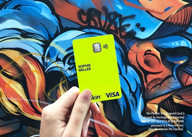
In Australia, Xinja and Pelikin are both on the Visa platform but that is about it-elsewhere Mastercard dominates.
Moven, in the Mastercard camp in the US, is eyeing up opportunities across Latin America, Asia Pac, Africa and Europe to complement its partnerships with TD in Canada and Westpac in New Zealand.
Aspiration in the US, also on Mastercard, has attracted around 1 million customers since launching in 2015.
It continues to attract attention as a result of its ‘pay what is fair model’ enabling customers to decide what they pay for its products, even if it is $0.
Elsewhere, Koho (Visa) in Canada and Nubank (Mastercard) in Brazil merit close attention going forward for any success in gaining market share away from the incumbents.
But it is to Europe in general and the UK in particular where the majority of the successful online digital start-ups are based.
Denmark-headquartered Lunar Way has a foot in both camps, via a Mastercard travel card and a Visa-branded credit card. But Bunq, Fidor, Monese, Monzo, N26, Starling and Tandem are all in the Mastercard camp.
At Revolut, three million customers and counting, both Visa and Mastercard branded cards are on offer.
The best card designs
The Revolut card design is arguably one of the better new breed of cards but is up against stiff competition in terms of best card designs.
Take Dutch challenger Bunq for example. Bunq is in the news for its partnership with Transferwise but also merits a mention for one of the more striking card designs of the digital challengers.
The bunq card looks great but any shortlist for card design of the year would have to include Starling. Its new card is simple and sleek and designed to function as a natural extension of its app.
The card strips everything back with the card details on the back with the colour scheme inspired by the indescent blue-green tones of the Starling bird’s plumage.

But arguably, the simplest marketing innovation in card design is the original N26 transparent card.
Now live in the UK, following its expansion to Denmark, Norway, Poland and Sweden and with a US launch planned for 2019, N26 wants to hammer home its message of transparency of fees.
A semi-translucent card design is a pretty good marketing device to get that message over in new markets.


